
Notes from the Studio, Vol. 11
Three features from Studio Isaac this week:
01. Perfecting a color palette
Selecting paint colors requires trust, patience, determination (and sometimes spreadsheets) to get that considered but effortless look. Rarely do on-screen samples translate 1:1 once they’re painted on your walls at home. Lighting, scale, surrounding finishes, and even the time of day all play a role. Here’s how we approach perfecting a paint palette for our projects:
Start with the bigger picture
Paint never exists in isolation. A color that feels perfect in one room can feel completely wrong two steps away. Before we look at swatches, we consider:
Natural light (north- vs. south-facing rooms)
Existing and planned materials (wood tones, stone, tile, upholstery) that might reflect the paint
Architecture and ceiling height
How rooms connect and flow into one another (including trim, baseboards, doorways, etc.)
Narrow selection first
Rather than testing dozens of colors at once, we curate a tight range of candidates:
Multiple versions of the same color (lighter, darker, warmer, cooler)
Testing undertones rather than chasing “white,” “gray,” or “beige”
Eliminating colors that look great online but don’t align with the project’s light or mood
This is where spreadsheets sometimes come in — keeping track of finishes, sheens, and room-to-room relationships.
Sample, sample, sample
We encourage paint samples to be applied generously and viewed:
On multiple walls
In morning, afternoon, and evening light
Alongside flooring, cabinetry, and trim
A color might feel perfect at noon and completely off by sunset. Lighting doesn’t lie!
Undertones
Two paints can look identical on a swatch and wildly different on the wall. Green, pink, yellow, and violet undertones reveal themselves quickly at scale. Catching these early (with samples on your wall) prevents that “something feels off” conversation later.
Think in palettes, not single colors
The goal isn’t one perfect paint — it’s a cohesive palette that includes:
Main wall colors and wall coverings
Trim and ceiling tones
Accent rooms or moments
How colors transition between spaces
Trusting our instincts
Clients often know what they don’t want before they know what they do. We listen carefully, guide decisively, and adjust thoughtfully. Paint is a powerful tool we have to shape atmosphere — and when done right, it makes a home feel quietly complete.
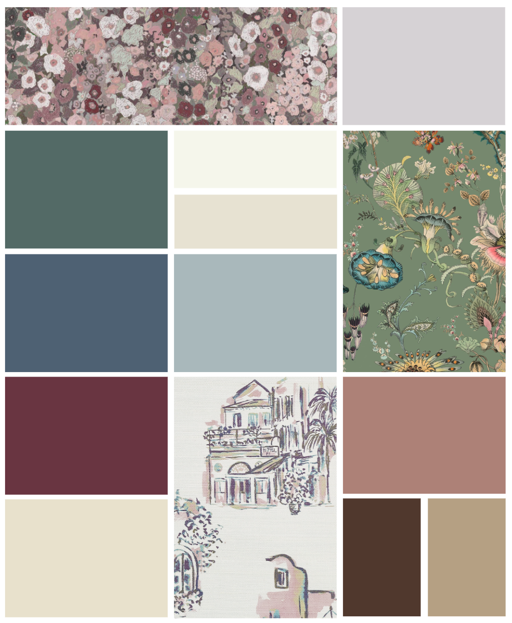
The paint color palette and selected wallpapers for one of our Atlanta, GA projects.
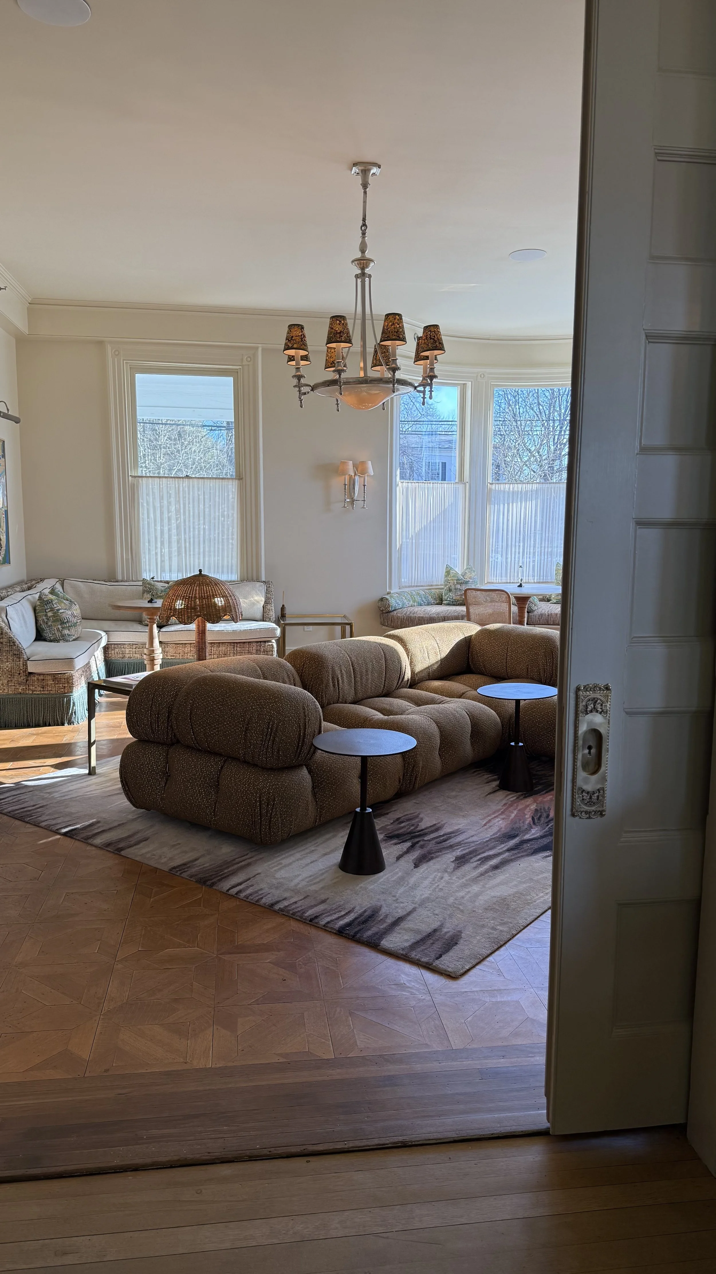
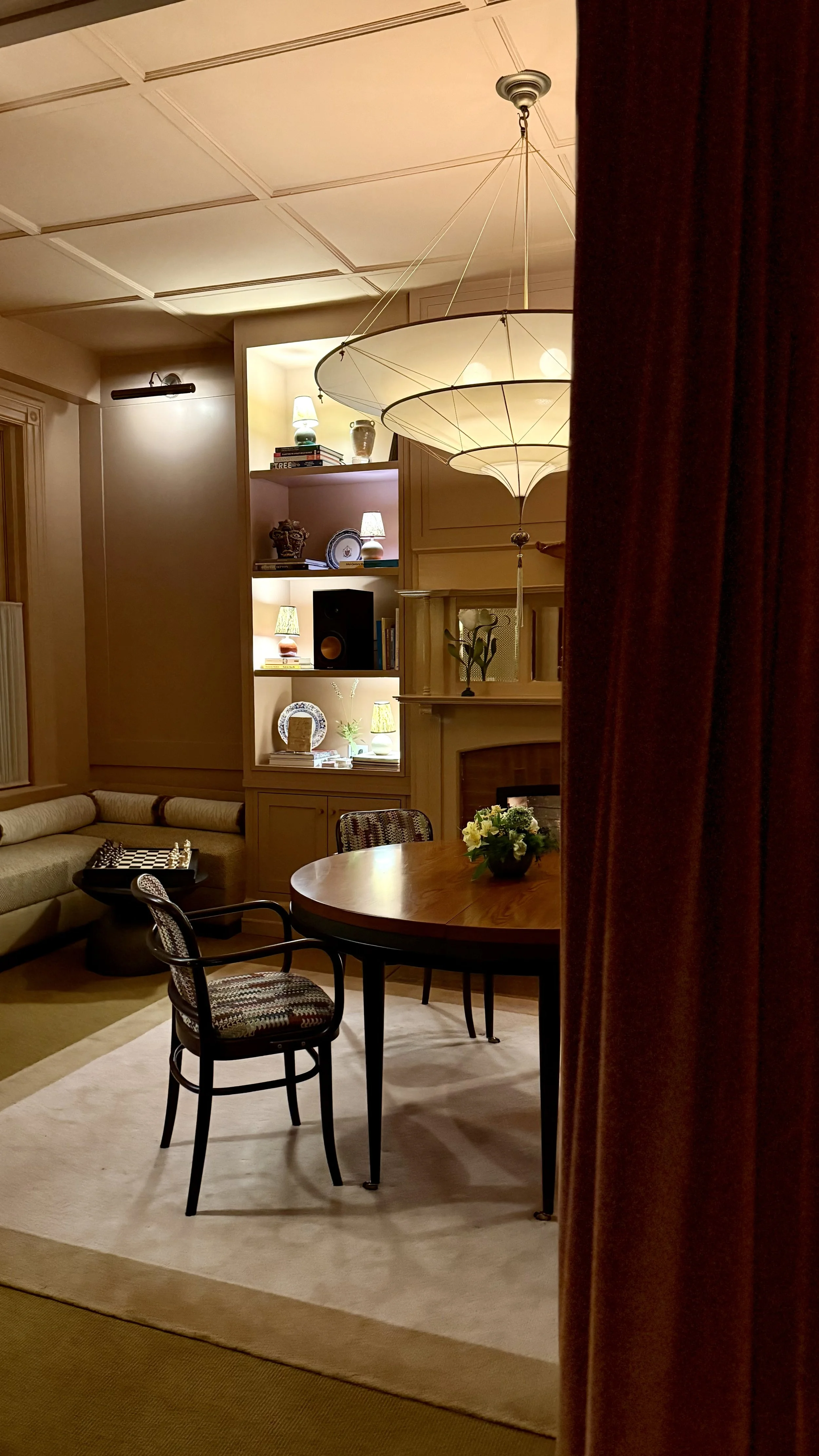
02. ESCAPING WINTER FOR WINTER
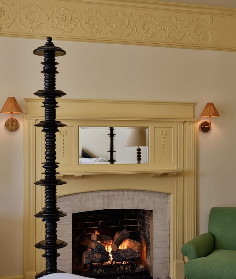
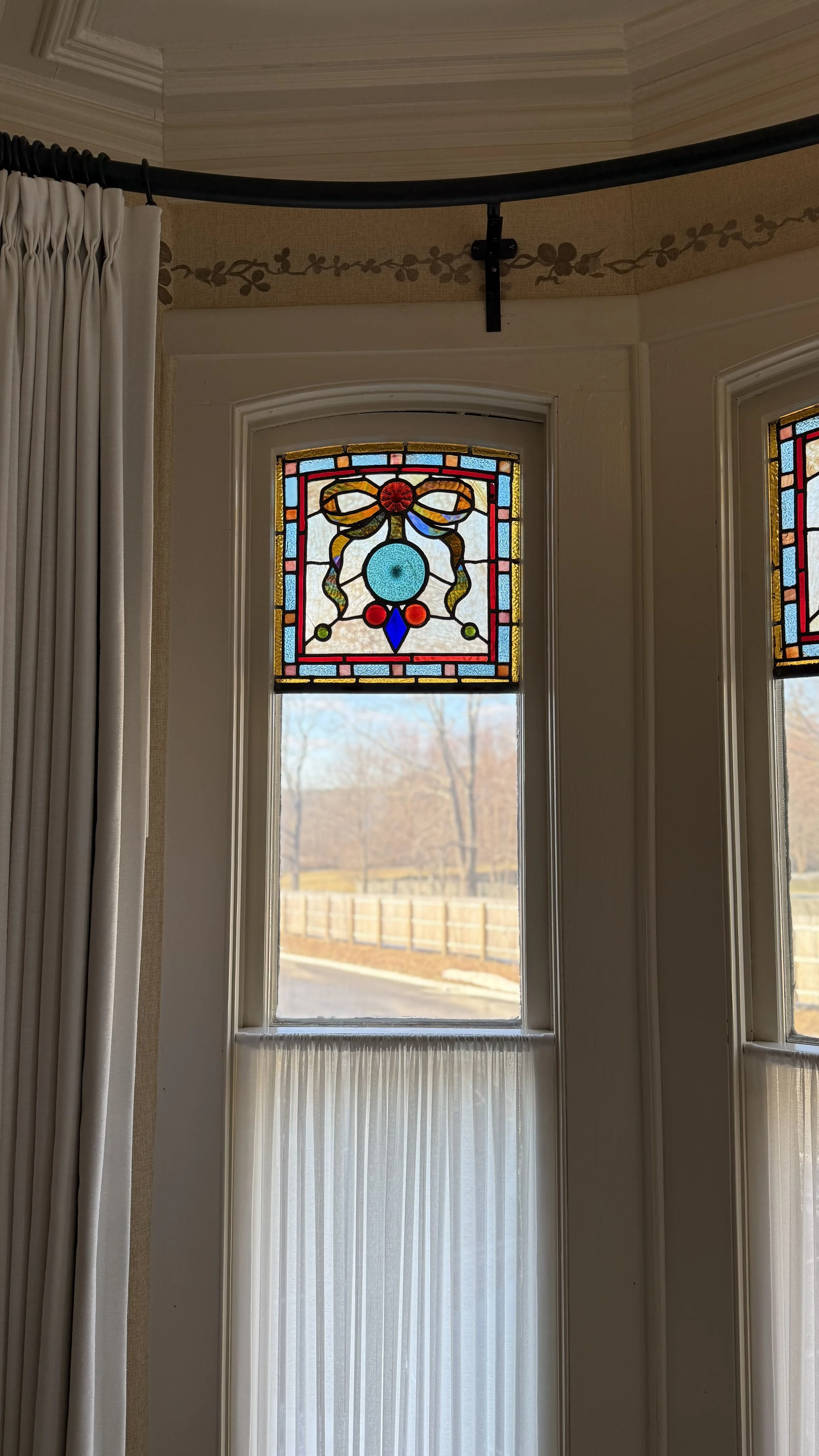
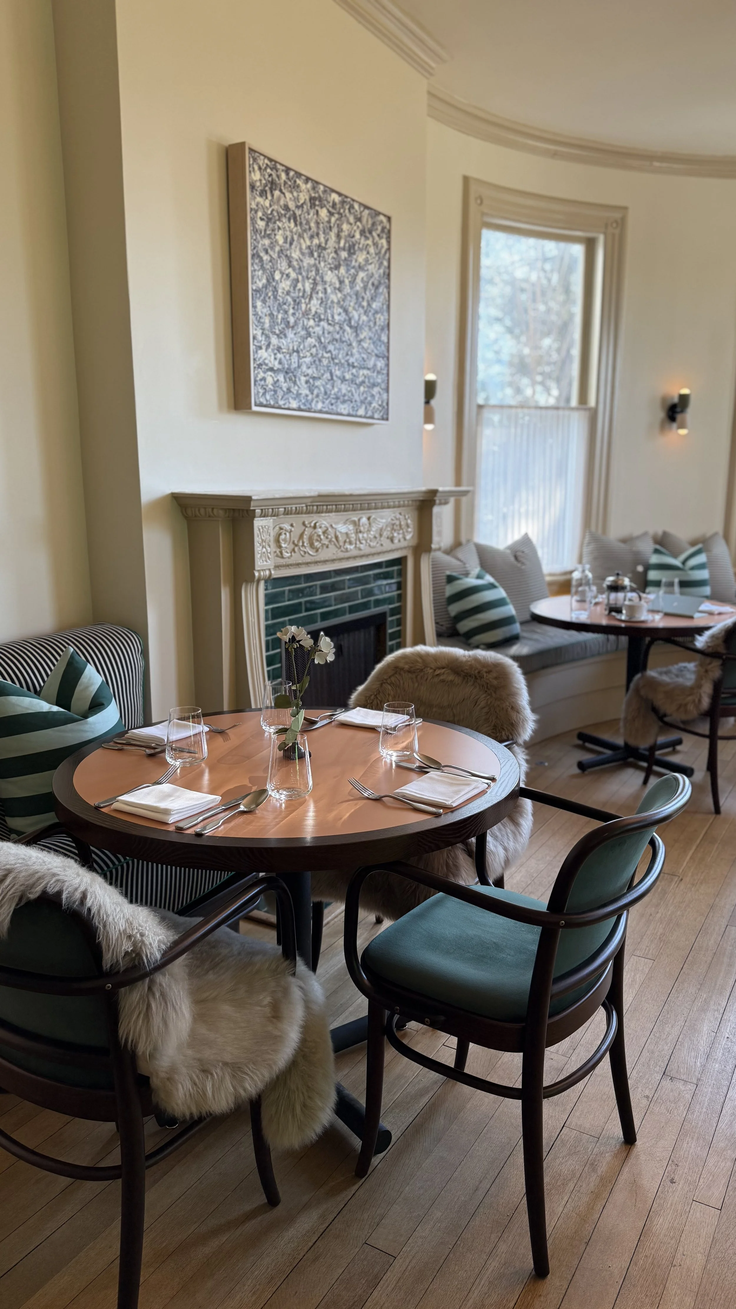
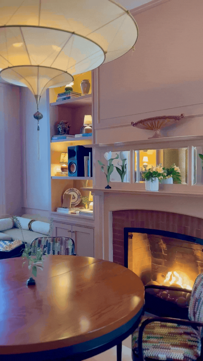
Recently, we swapped one cold New York night for another in Litchfield, Connecticut at Belden House & Mews, a Michelin key hotel that fully embraces cozy, sumptuous design. From crackling fireplaces to beautifully layered interiors, it’s the kind of place that invites you to slow down and notice the details.

Click to view Belden House’s Instagram.
The newly completed interiors strike a careful balance between historic character and modern restraint. Antique furnishings are paired with tailored upholstery and quiet color palettes.
We loved the hotel’s approach to warmth through materiality. Rich wood tones, tactile textiles, and thoughtfully chosen antiques create spaces that feel both elevated and deeply comfortable. Fireplaces appear again and again—make the common spaces feel intimate, and the guest rooms feel like private retreats.
Make sure you grab dinner (or really any meal) at the hotel’s restaurant and take time for yourself in the Bathhouse.

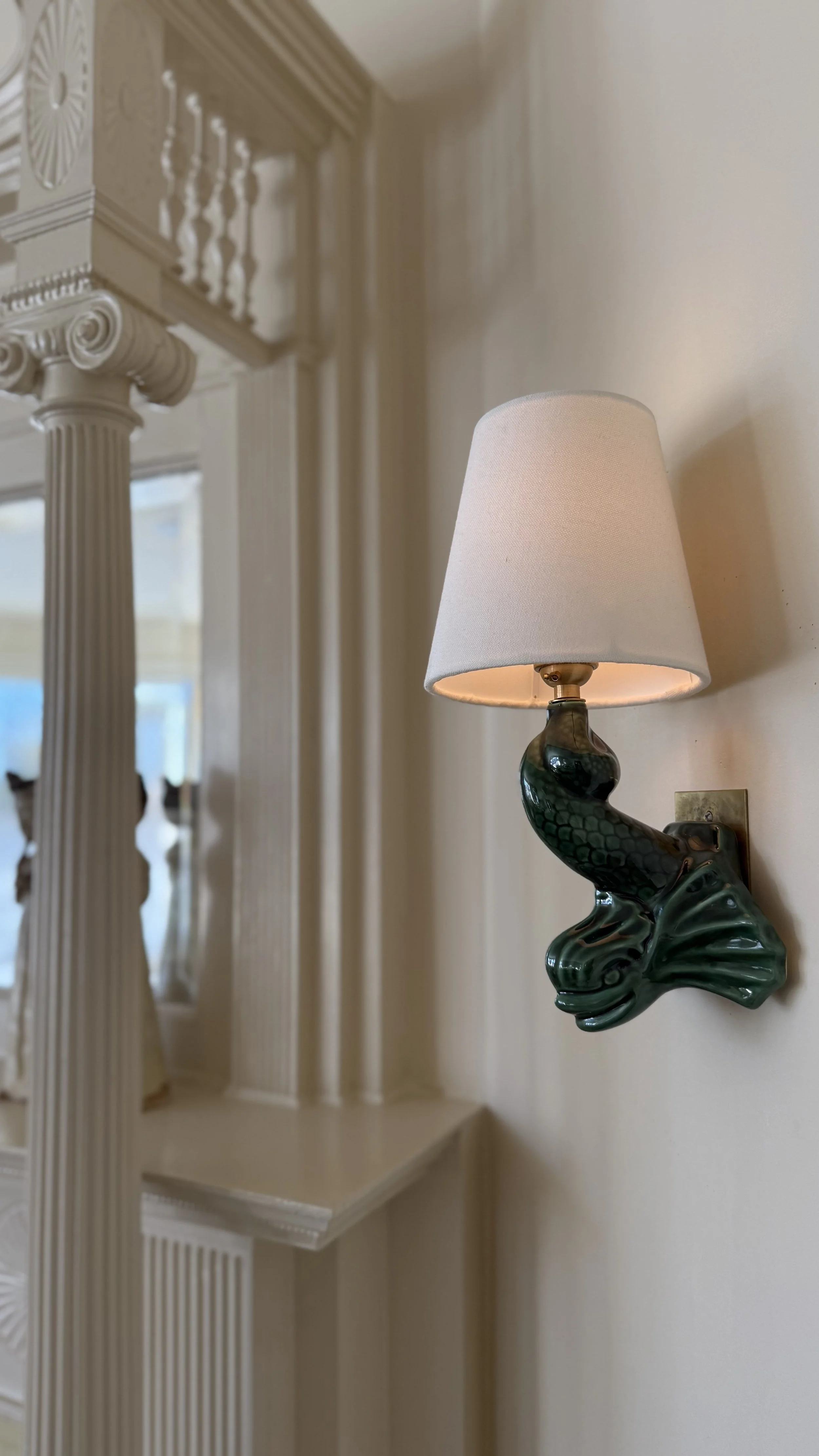
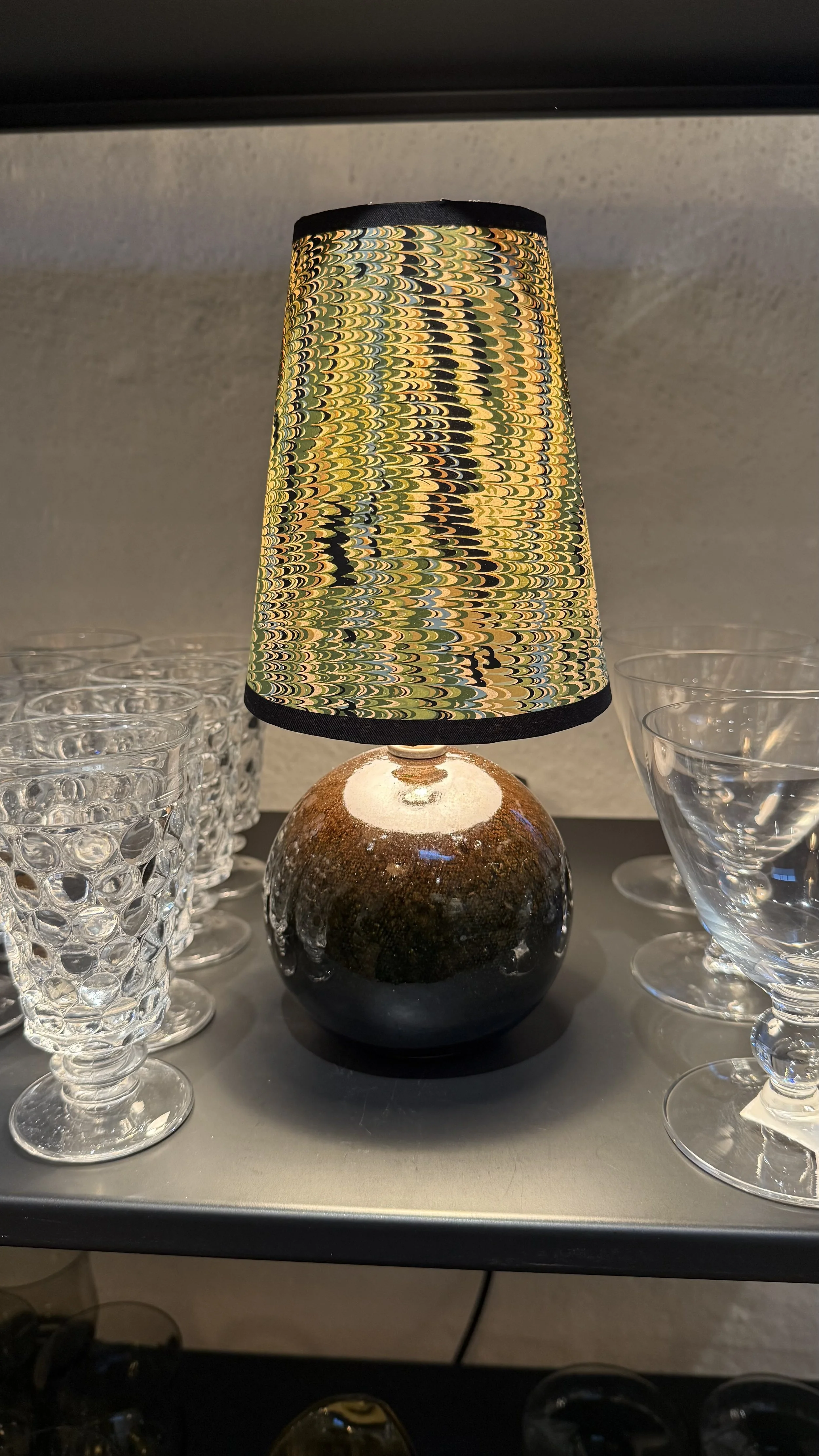
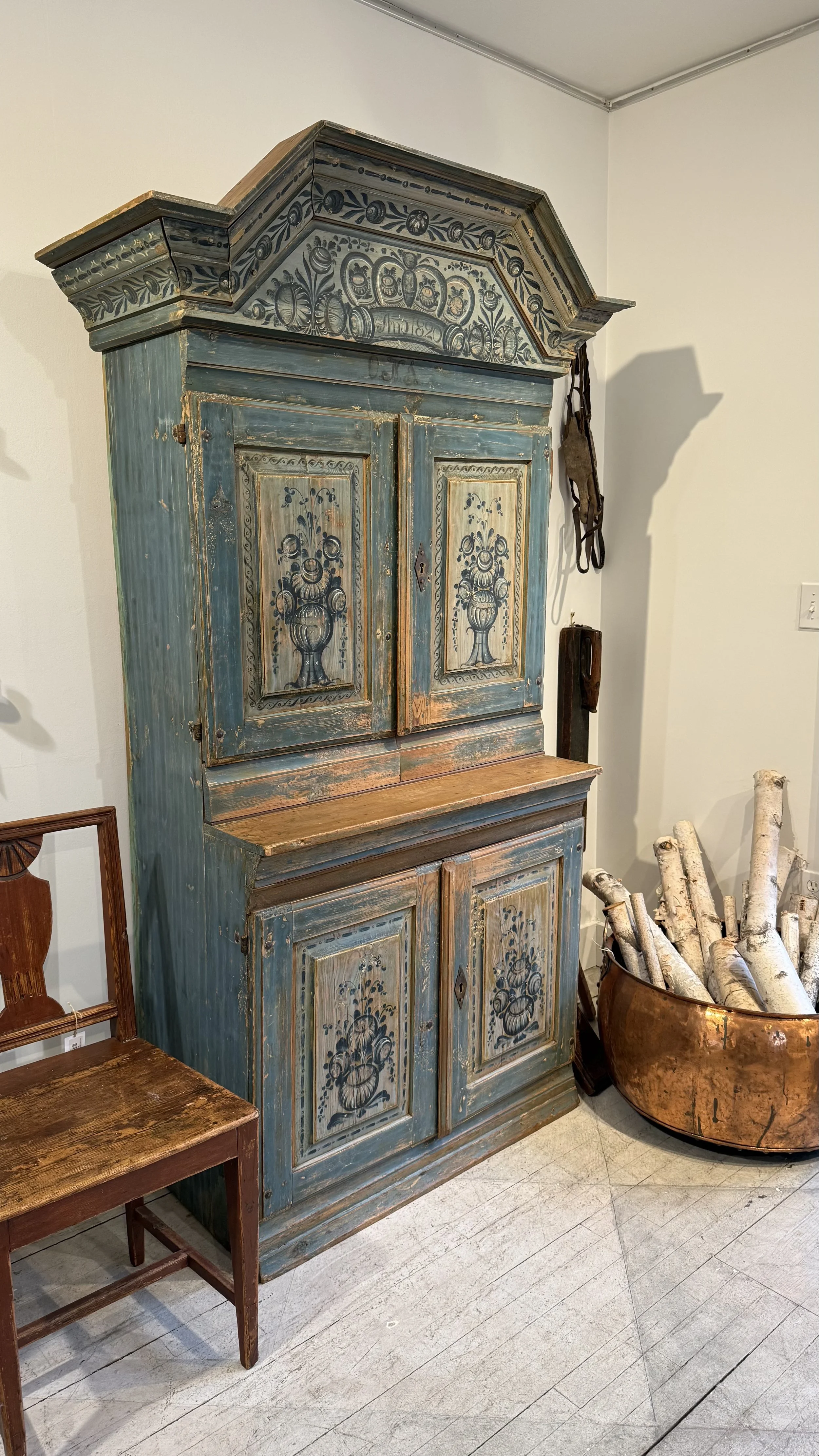
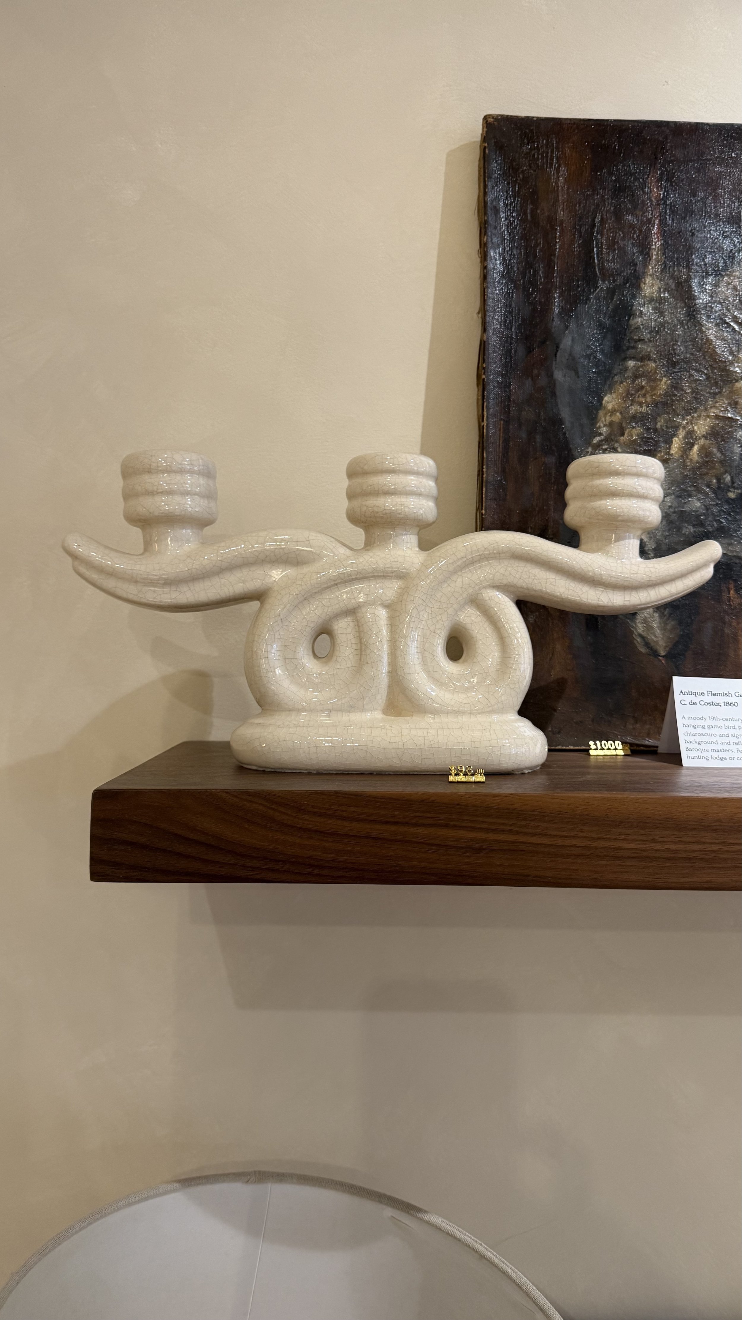
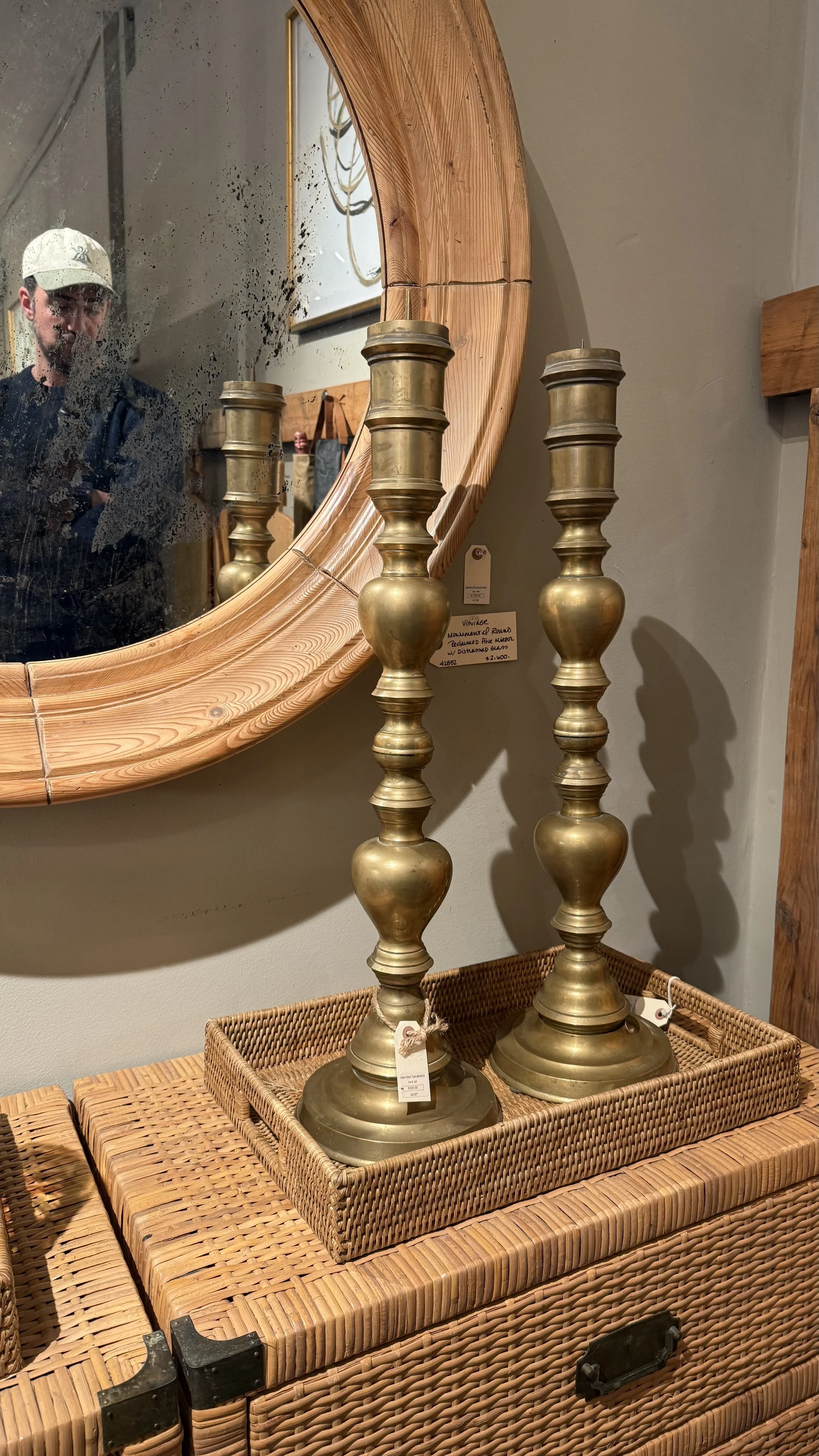
The nearby town of New Preston is a dream for anyone who loves antiques and one-of-a-kind finds. A few standout shops offered everything from timeworn furniture and vintage lighting to small decorative objects with real patina—click through the photos to see where we found each treasure:

03. Can we design…
A room around [insert your favorite place book, material, color, accessory, etc. here]?
Yes, of course. Perhaps, we even prefer it. A north star guides other design decisions and creates cohesion. And the most jaw-dropping rooms are anchored in something that inspires clients' nostalgia and excitement.
Let us know, what would you like to design a room around?
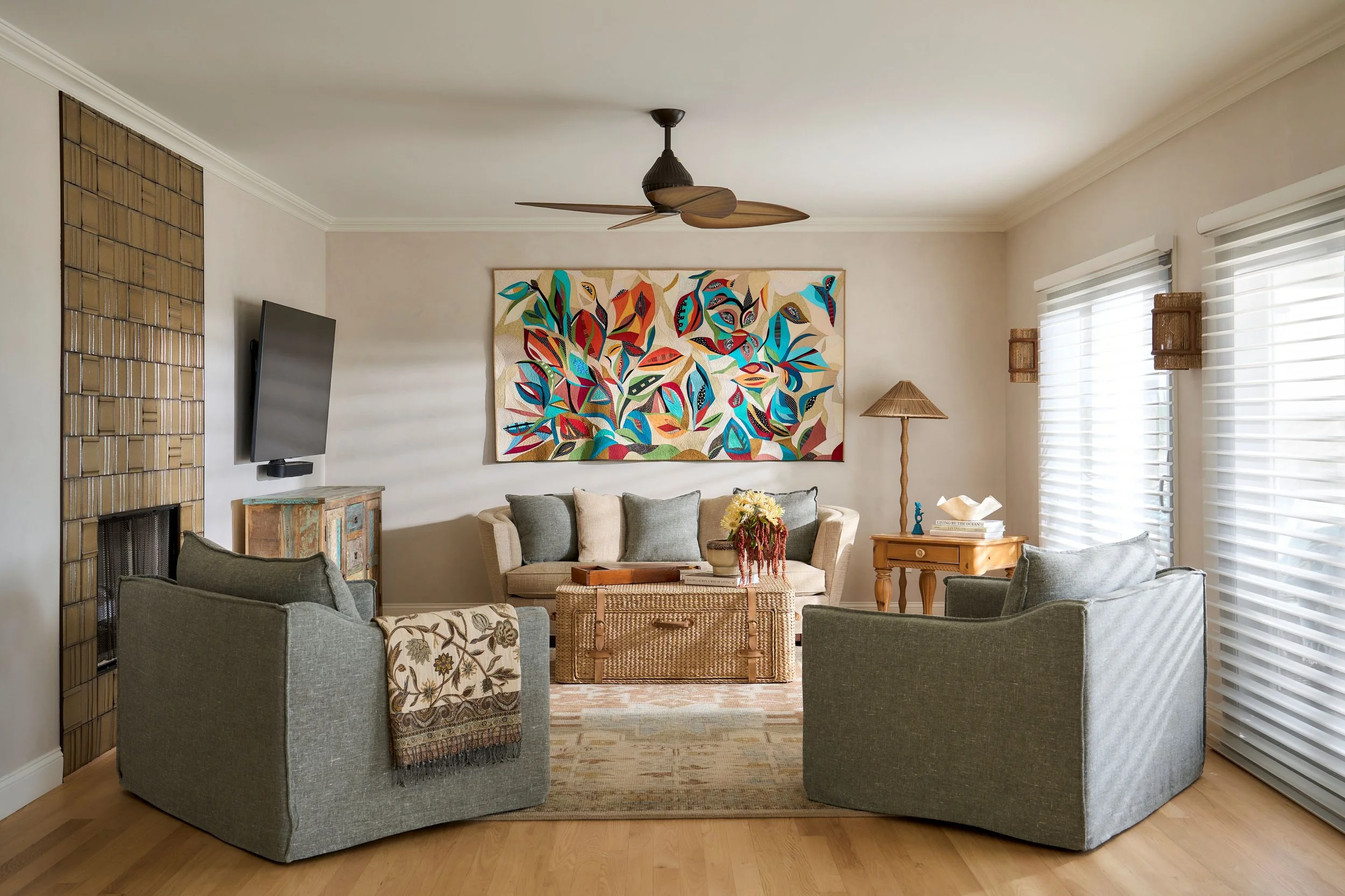
A living area designed around the owner’s own art quilt, shown hanging on the focal wall.
If you enjoyed reading this, consider getting Notes from the Studio straight to your inbox.
Subscribe to our newsletter below: